Overview
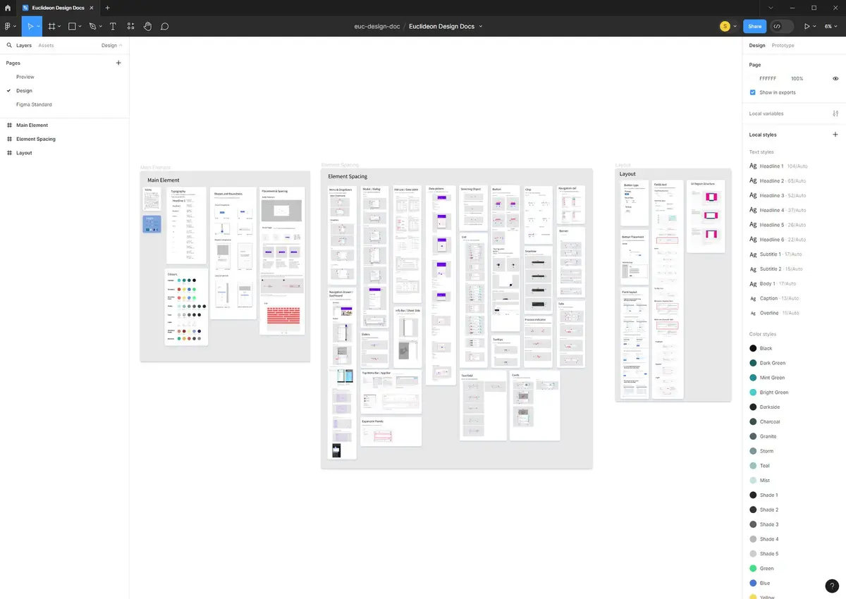
This UI Design System, inspired by the latest Google Material Design guidelines, serves as the cornerstone for consistency across our product suite. It encapsulates our commitment to a cohesive user experience, emphasizing clarity, usability, and aesthetic appeal.
Core Elements
Colour Palette:
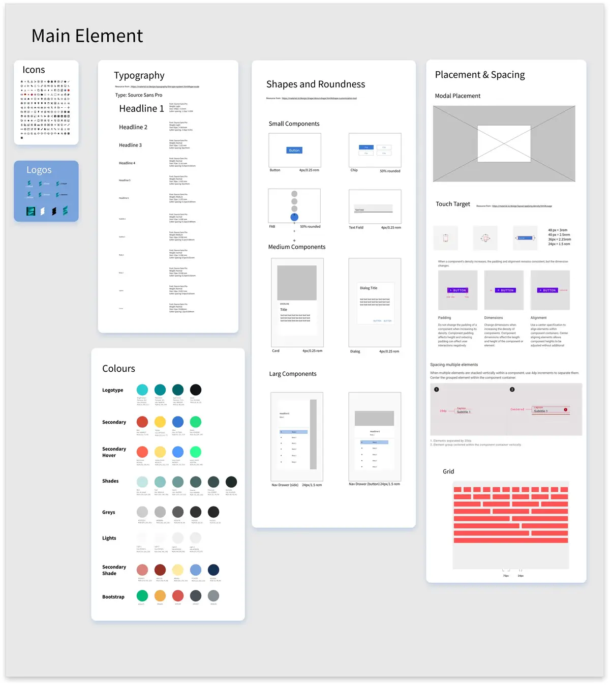
Adopts a versatile colour scheme that supports accessibility and user engagement, directly influenced by Material Design's colour principles.
Typography:
Utilizes a carefully selected typeface that enhances readability across devices, aligning with Material Design's typographic scale.
Iconography:
Features custom icons derived from Material Design's visual language, ensuring intuitive interaction cues across our applications.
Design Standards
Element Spacing & Layout:
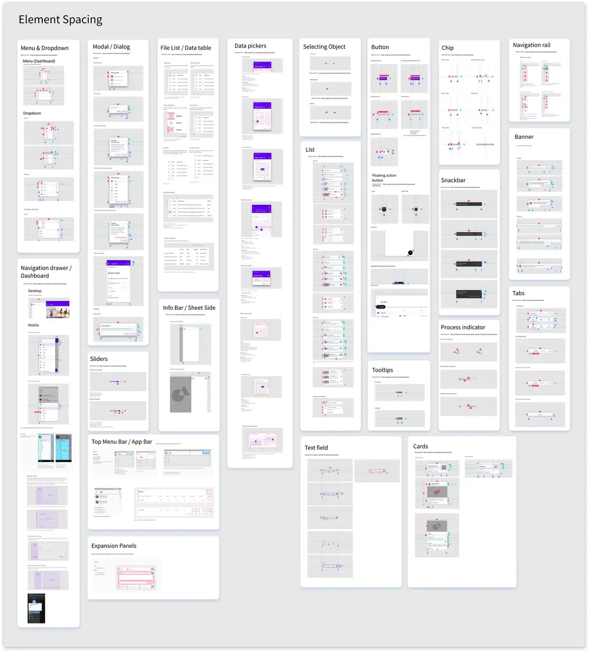
Employs precise spacing and layout guidelines to create a harmonious visual flow, facilitating a seamless user journey.
Implementation & Impact
This design system has been pivotal in streamlining our design process, fostering consistency while allowing for flexibility and innovation. It has enhanced collaboration among our design and development teams, significantly reducing design debt and accelerating product development.


